I LOVE talking about blocks, studying blocks, and playing with them in Photoshop... I am always on a quest for great blocks and trying to figure out what makes them so great ... So I started this companion blog that will be devoted to this quest. But also check out my regular blog at http://olderrose.blogspot.com

Showing posts with label advice. Show all posts

Tuesday, November 20, 2012

Don't overlook black!


When you're laying out colors for a project it is easy to overlook black as your accent color.  I was reminded of that again today when Sharon Boggon posted her new CQJP project.  Not only is there black in the focus fabric in the center, the black and pink braid is a stunning addition... I can hardly wait to see this stitched.

I post about Sharon often so you've probably already looked at her famous "I dropped the button box" quilt.. I know I urged you recently to check out her colors combinations but now go again and see how often she uses black as an accent color... especially  with gold , beige , and brown.


The crazy quilter who, in my opinion, uses black most effectively and with great drama is Maureen Greeson.
She also does the most elegant ribbon work.. You must browse her blog just to see her ribbon flowers.


Maureen's work


Maureen's work.  There is great simplicity and elegance in everything Maureen does..


This is lovely block of black and pink is by Pam Kellogg... Pam is starting a new series of online classes where you pay by the class,  She posted her schedule on her blog today. She is a master at intricate and unique seams and has her own method of using waste canvas to do them.


And don't think that it's only with  pink where black is fun.... it can be dramatic with any color... This a RR block done years ago by Jo Newsham and the beautiful seam work was done by Leslie Ehrlich.

Tuesday, November 13, 2012

It can be easy being green

 You may  have a problem getting 3-4 shades of green to blend well together but you can't go wrong using 12-15 shades of green...  I'm repeating a 2010 post because it addresses this problem and directly relates to the [previous post.

(2010): Cheryl A. brought this green block to show me when we were in CT for the CQ Adventure... It is from a tone-on-tone RR and was made by Cathy L. It will be a great exercise in using contrast without depending on color. After she showed it to me and then we weren't able to connect again to discuss it . That night at dinner Cathy K, Diane M and I began discussing green plants, animals, etc. to use as a focal point... Sharon had had a fantastic Brazilian grasshopper which would be great and we thought of alligators, frogs, turtles, lizards and various bugs....I thought maybe even a John Deere tractor.

But if it were me doing a the block I immediately think of birds and a parrot or parakeets would be at the top of my list. When I start looking at images to do a bird I am especially looking for birds that are "doing" something or in an interesting position such as both of these photos..The bird eating is a photo from the archives at this site.. a fantastic site for anyone loving birds...do visit it... I'd probably do the bird in embroidery on a hoop or it could be printed and appliqued on... but another great option is a method Alison Aller is using a lot and would work here beautifully. She would print the parrot on fabric, add fusible interfacing, cut it out, and iron it on the block. So now we have added our first contrast... size! The parrot immediately changes the perspective of the piece... Then I would begin finishing the seams in as many ways I could think of using stitches of vines and leaves wandering here and there on the block... starting to work on another contrast...texture! Then I'd add branches using a heavy perle such as a 3....bringing the parrot to the foreground... Another contrast... dimension!


To further these steps I'd add the largest leaves using heavier threads, ribbons and textured threads such as velour with maybe even weaving some leaves attached only at the branch. As the final steps why not including a dragonfly with green organza wings and a jeweled body...and maybe a hide a lovely tree frog and even a salamander...  So to sum it up we have used all greens but have added variety and interest with contrasts in dimension, size, and texture...

Addendum:  Later I was able to see Cheryl's solution which was very clever indeed... a green man tree... I went looking for a photo of it this morning with no luck...  I'm hoping if Cathy L. or Cheryl read this post they will send me a picture of her block..

Thursday, November 8, 2012

Part Four - Second No-Fail Approach to Color


Remember I started these posts for stitchers who were unsure about choosing colors... I said there were two "NO FAIL" approaches...  The first was limit your color choices.  

Well the second  "NO FAIL"  approach is just the opposite.... USE EVERY COLOR!!!!  This block is an excellent example and was stitched by Cathy LaBath... She adores color but has written me repeatedly that she is horrible at picking out colors...

Yet to appease her thirst for bright colors she uses them with abandon  making dozens of these scrappy quilts..  They work because of the multitude of colors at random... You cannot fail making one of these quilts and the same approach is true applied to crazy quilting...

She's not comfortable choosing and controlling color but she doesn't let that stop her.. Cathy has her colorful scrappy quilts on her blog.


There are some people who have a joyous sense of color gone wild and are able to choose and control it.  I posted awhile back about two such people Lauri Burgesser and Allison Aller.  I keep a special drawer of  intense colors just to use on Lauri's blocks. I admire everything done by them... Their love of color and their use of vibrant colors add energy to everything they create.


 Two other stitchers who consistently make wonderful use of vibrant colors are Lorraine Stobie and Nikki Lee Seavy...  Not only are they skilled stitchers, both have Esty shops where they sell supplies  ablaze with color. Nikki Lee Seavey sells hand dyed laces  and Lorraine sells hand dyed threads. 


One of the newer members of CQI whom I have been watching is Pamela Pincha-Wagener   who picked these colors for her blocks in the Goldwork 3 RR... She wrote that she has never made a pastel block...  I've asked her  if I can work on her last block in this RR just because the colors are so yummy and would be a real challenge for me...

Probably the most famous crazy quilter for using "Color Gone Wild' is Martha Greene of Oklahoma. She refers to herself as using the "roadside carnival" approach..  She has participated in many exhibitions and won numerous awards and has been an Artist-in-residence at Oklahoma State University for 15 years.  I met and watched her work in Colorado a year ago.. She started with a pile of brilliantly-colored scraps and picked them and stitched them completely at random... She often teaches workshops around the country.. Unfortunately I could not find a website nor web address for her...

So if you love color and have been hesitant to plunge ahead, you might want to experiment with this approach... A word of caution would be to start with solid colors or use prints with a very tiny pattern.  This ensures that your fancy stitching will show up.  Then once you have your colorful block sewn, get out your stash of threads and start pulling  lots and lots colors...

If  making a block of every color and working with thread of every color is too much for you on your first color adventure, try using threads of every color on  black blocks. Here is a RR block stitched several years back by Jo Newsham of NZ using lots of intense color on a black background.


Cathy Kizerian's CQJP project is going to be spectacular.  She is using the intense colors in a piece of vintage needlepoint and using them for fancy stitching on black crazy quilted blocks.. It is unassembled at this point and pinned to her wall. She   has just a few more to go...


If these people had a neighborhood, it should look like this!


Monday, October 29, 2012

Color Comfort - Tricks and Guidelines - Part 1

Picking your feathers.....is there a bird here that reflects your color comfort zone? Most people are fairly secure with their color comfort zone but I can tell from work I see that there are a lot who struggle with color.  If you have or  are starting a inspiration file pay special attention to recurrent colors that have attracted you..  PICK NO MORE THAN THREE.  That is the place to start...  Now here I am talking about a successful block for yourself.... The key in the beginning is limit, limit and limit... It is so easy to be overwhelmed by a pile of fabric stash and go a little crazy... It doesn't matter if the colors are intense or subdued... just pick three of your favorite.

In this case I have chosen three muted shades of pink, green and beige.(my personal comfort zone). Gathering your color choices as threads and fabric is the first step... The fabrics can vary in texture but keep any patterns VERY small or muted. I can't emphasize that enough at this stage. Patterns can be very distracting for beginning exercises.. Make a block!

Now start laying your threads on the block matching the colors as close as possible. If you want to use ribbons or braids add them with the same guideline.  Match as closely as possible. Using all the same color of thread and trims may seem boring but I guarantee that you will end with a block you will love. Carefully pick your threads and STICK TO YOUR choices... Do not start bringing in other colors later... There are lots of ways to add more interest with buttons, lace and motifs, etc... But stick to your original choice of colors and your block will have (my favorite word) harmony.... The next post will show some fantastic examples of just this technique of limited color.

But when you know your own comfort zone what happens when you  want to stretch a bit or get wild and crazy?  There are tricks for that also that I'll cover  in another post.

And then what happens when you join a round robin and get a block of colors that make you gasp?  This person has picked  those colors because they loved them and you are part of a team who all want this RR to be a success.  Again there are some tricks to do this and I will share.

Tuesday, January 17, 2012

Help with a block?

Hi Gerry, I am wondering if you can help me with my Swedish Country block  I have lots of ideas   but not sure how to decide where to put them. I have attached a pic of the block so far and also pics of the elements I want to add.  The flag is blue and yellow, so those are the main colors, but a dash of red and green will also be added.
I added the silkie because it was by a national artist (Larsson) and the right colors for the block, but now I am afraid it is too small and my idea to add the piece of light blue to the top to "extend the sky" is causing problems. Do you think I should cover the pic and add it elsewhere?
 Any suggestions you have would be appreciated.  Thank you so much. Darlene


Well this is going to be a little long because there are some interesting points.  You were very clever to pick Carl Larsson as the artist for this block... He is a contemporary of our Norman Rockwell and both focused heavily on family and everyday life..  You were right in the the silkie is too small and really makes no impact at all...  I looked for that particular painting with no luck...


Often when making silkies the option of severely cropping can be a big asset...  Most of the time the image chosen is just too busy to make an impact on a block...  Focusing on just the elements that are relevant to your block makes a tremendous difference.


Since I couldn't find your painting I chose another winter scene.  You can see that the picture as a whole is too complex, but if you crop out everything but the child it is much more suitable.
Since the elements you chose are quite simplistic and lovely, if I were you I would follow along with this throughout...  I love the birds (big surprise) and not only would I use the larger white one which you already have on the block, I'd repeat with several of the smaller one.  You had thought of adding skates but why not also add mittens, hats and scarf in one cluster... The scarf and skate lace could make fantastic directional elements.  Be sure to do your flag "waving" so it add additional movement to your block.

Just an added thought or two... I adore the twiggy blue and red things by the dala horse and encourage you to use them... Also I googled Swedish needlework and it is a goldmine of inspiration for seams. You might also consider a snowflake or two or maybe even some norther lights...
So using all your choices and a couple of mine  I whipped this rough draft  up in photoshop and hope it gives you some directions...

And that's my 

Monday, January 16, 2012

Embellishi​ng busy blocks

An email from Lauri Nuske this morning:

"Hi Gerry,
I participate in rr's and dyb's and have fun embellishing the different blocks. Most blocks I send out are solids or light patterned.  So when I get a block that is heavy patterned, like lots of flowers and calicos and dark prints, I get stumped as to what to add that won't get lost in the print.  Any suggestions?"


Well Laurie this is always a problem for me also...  We all want to do our best and have it show... but as you say it is difficult, if not impossible, on busy blocks...

First you have to be bold and willing to modify the block.. Consider using all-over stitching or  large clusters such as Cathy L. used here.  If it doesn't have a silkie, add a large one...  If it does have a silkie,  embellish a 2" frame around it to make it the focal point and draw attention away from busy prints. Look for laces to cover areas, large motifs, very wide ribbons and even patches of fabric. I covered an entire patch on a block last fall. Tulle or organza can soften difficult areas nicely.  

Sharon B. incorporates some large busy prints in her work but balances it with large dramatic buttons, dense floral clusters, and heavy and/or textured threads.

Everything you use or do will have to make a statement stronger than the prints.  The next time you get such a block send me a picture of it and I will see if I can give you some ideas...

But personally I find a whole block of busy prints extremely discouraging and it makes my work much less enjoyable..   Last spring I did two posts on this very subject and how Cathy K. and Janet P. handled busy blocks head on.

http://blocktalkwithgerry.blogspot.com/2011/06/whats-so-risky-about-bold-prints.html


http://blocktalkwithgerry.blogspot.com/2011/05/i-happened-across-work-janet-in.html

Note: My life is finally settling and in a week or two things should be back to normal...  I missed doing this blog and noticed several emails for it.  I will catch up as I can..  Stay tuned.

Wednesday, December 7, 2011

Response to comment!

Yesterday I received a comment that I am more than happy to respond to.....  "I have noticed in the past that you and many others talk about how elements should lead the eye around a block.....  But in this block you have placed the blue bird which is a fairly strong element flying right on out of the picture .... would you mind commenting on that please?"

Well when I placed this bird my eye was following the contour and the thrust of the bird which is upward.....not outward..


 In fact in my eye every element of this bird goes up ...not out.!!!


And so to me it was completing the path in the block.


To be flying right out of the block the bird needed to be tipped forward for the contour to aim it in that direction.   Note that the most important directional element of the bird is along the back...When placed side by side I hope you can see the difference... Of course Angela could tip the bird even further upward or place it closer to the rocks......

I am happy to answer questions at any time...

Sunday, November 20, 2011

Makeover for Kerry

On rare occasions a round robin will break down...Sometimes it is because what was chosen was too difficult for a participant, someone will get ill, someone has to quit or blocks get backed up and have to be moved on unfinished... But in this particular round robin I think ALL of the above happened..  Kerry Leslie and I were in this Beaded Round Robin together... I was third in the rotation to get her block after someone was ill and someone had quit...  This is the block when it arrived to me. It was pretty bare and what was even worse Kerry had expressed a wish for dragonflies on her block and there were only the two tiny ones.


Since there was only one person after me I had to make a BIG splash in a short time. I set about to make as many dragonflies as I could and do them all differently...  The big focal point is the dragonfly in the circle and the others pretty much blend into the patches... especially those lower left...  I did leave a little room for the last stitcher and hoped she add another dragonfly... but she didn't.

Over the years this block came up occasionally in email exchanges and at retreats and Kerry said she had always been meaning to renovate this block and make it truly a dragonfly block...  Since I had enjoyed doing all the dragonflies in the first place I had her send it along and set about remaking it....


Once I had cleared it of anything non-dragonfly it looked pretty much like this... At this point I decided to make another change also...  All the fabric were lovely and all were in the same value range except  the one lower right..  So I put it on my bulletin board and auditioned various alternatives...


After trying the several colors you see here I decided on a medium green..


So I added all the  beaded greenery and even more brass dragonfly charms which I painted with alcohol inks and I moved the original dragonfly charms to upper right...

There are dragonflies with lace wings, jewelry wings, metal filigree wings, organza wings to name a few and then I was left with the new green patch lower left  and Connie K. suggested putting a frog there and that just tickled my fancy..  So here is my whimsical frog on felt in frog heaven with all the dragonflies..


But as in the case with Janet's block I am leaving a decision for Kerry with this block...  At the end I was debating whether to remove the purple lace-winged dragonfly.  Here it is either way...

Friday, October 21, 2011

My Two Cents Worth for Angela.....

"Hi Gerry.

I look forward to each of your block talk posts and thought I'd take a shot to see if you might evaluate my block for your blog. I took part in Nicki Lee's HGTV CQ Challenge.I fell in love with the swirly focus fabric that was provided as well as the ribbons and charms we were given to use. I suspect that the floral spray in the upper right could use some more work.

I tried to extend the green to the left after taking a step back from it, but I'm going to dig through my stuff and see if I don't have any of the original green ribbon left, because I'm not sure the embroidery really worked. 

I'd love any feedback you have!"

Well I emailed Angela right away and told her that I also loved the swirly fabric and don't bother looking for the green ribbon as that part all contributed to the tropical theme of the block....Acapulco!!! 

The real problem in my opinion (and we know I have one..) is the whole patch upper left,..  With all the lines it has a very strong impact and since it occupies as much or more visual space than the lovely swirly fabric, it overpowers the block...  It doesn't relate to the tropics theme or to anything else on the block... 

Once you look at that patch your eye continually keeps going back to it... Can you see when it is blocked out how all of a sudden what is left is working... So it has to go and since Angela has lace lower right I   covered  upper left with lace with a little help from photoshop.

If even nothing else but the lace is added, the block is gorgeous.... But I wanted to go a step further..  I have to admit that I've never been to Acapulco so I went to good old Google and started looking at posters and pottery from Acapulco.


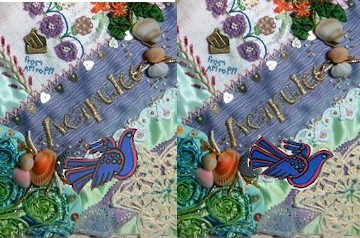
Of course I found a lot of palm trees but I immediately was drawn to the plate in the middle as the flowers looked like the flowers on Angela's block.  But I loved the little bird also and saw these blue stylized birds on lots of pottery plates and mugs.

So I added some palm trees to the upper left... bending in to bring the eye around... and a little blue bird of happiness at the bottom right... Remember when I said I loved the quiet space by the image in Wilma's block...?  Look here is one again next to the heart...  Need those quiet spots....  Now for a lounge chair and something fruity and frosty to drink... 


Sometime taking something OUT makes all the difference..... and that's

Thursday, October 20, 2011

My Two Cents for Jacqui A.

Jacqui is not very far along with this CQ "bib" and sent it along for some input and she had a VERY important question....  The photo was large enough but not well focused and was quite grainy and I felt I wasn't seeing it all... But you even though you can't make out the detail such as her crystals you can see the overall progress...

There are two things about this piece to keep in mind..  First it is not very large so you want to take advantage of every opportunity for lavish embellishment.  Second it is going to be worn around someone's neck so it will really be seen up close.


The very first thing I'd do if I were working on this is really expand  the seams embellishment...  There only two seams of any length so go all out....use trim, lace, beads and stitching all at once on both.. Make them opulent...  Here are some examples... Obviously I'm not recommending these colors....only the lavishness... We certainly don't want wimpy seam treatments....ever!!!


The next thing I'd address is the lace motif on the right..It is large and  naked... In order for it to become part of the piece itself it needs to be again lavishly beaded and maybe even some metallic threads included..

 Jacqui added " I am such a symmetrical person, this is all very hard for me but I love CQ and want to do much more."  Symmetry is not nearly important in CQ as balance is but the principal is similar...  So you have this large bold motif on the right side of the block and I'd balance it with something such as the floral spray I put on the bottom left...

The last suggestion is different buttons..  The idea of the buttons on the lace is great but two are quite ordinary buttons... Go to the button department at a fabric store and get some absolutely star-quality buttons...

Now for Jacqui's very important question.... "The bottom left is already so bright and shiny with the gold lame woven into it what on earth can I do to decorate it?" Well with this one you're lucky as it is only shiny and glitzy, and so just work right over it with aplomb!!!   But think of whatever is in any patch as "wallpaper" and it's suppose to showcase whatever you put on it...  No matter how beautiful the wallpaper is in a room we still use it to furnish the room..."   Keeping in mind that if you run into a patch that is insanely wild and colorful, have no qualms with covering it up with lace, paint or anything else.
It's the needlework, not the patch, that's important...  As always these are just my opinions and I'm sure anyone else looking at it would see things differently...  But that's