
I have and use Image Composer and Photoshop but I still LOVE Google's Picasa because
1. It's free
2. It is so user friendly
3. It is extremely versatile...
4. It is so quick and easy.
5. It does an amazing variety of things
6. It's very low tech....
6. And I repeat ...it's free
Note: At this time there is still a similar program called Picnik which is also free. It is also great but will be ending very soon.
Before you convert your COLOR photos to sepia there is a very important step you need to do first.... convert them to black and white THEN to sepia.. You'll be much happier with the results...
The following is an update of a post on this subject in March 2011:
I accumulated several hundred pictures in my suffragette file.. and eventually it's time to get serious about printing them on fabric... First I need to do some editing and by far my favorite program for this procedure is Google's Picasa... As you can see in just these few there is great variation in color in my collection of photos....and I wanted them ALL to be sepia (brown) tones since there will be so many of them on the quilt....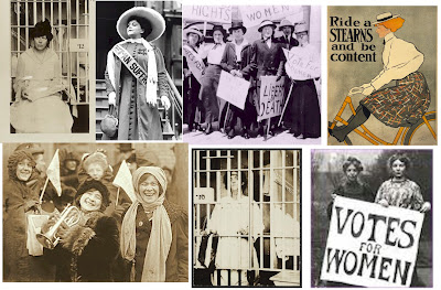 Mine were all black and white to begin with so there was no need to convert them...
The following is an update of a post on this subject in March 2011:
I accumulated several hundred pictures in my suffragette file.. and eventually it's time to get serious about printing them on fabric... First I need to do some editing and by far my favorite program for this procedure is Google's Picasa... As you can see in just these few there is great variation in color in my collection of photos....and I wanted them ALL to be sepia (brown) tones since there will be so many of them on the quilt....
 Mine were all black and white to begin with so there was no need to convert them...
 Picasa has an "effects" selection of choices and one of them is "sepia" so my first step was to apply that to all the photos I wanted to use...But even with all of them being sepia there was still more variation in tone than I wanted.
 So the next step was to use the "saturation" selection.
Third down on the left....it is a choice I use on all photos, colored or not, which are to be printed on fabric... Color is always lost in that process so intensifying color in the beginning makes for a better end product. But in this case I'm using saturation to put many photos into balance. But as you can see the tools include sharpening, changing to B&W, tinting, adding a glow and soft focus among others... There are many other tools in the basic fixes and tuning sections.
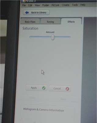 On most of the effects tools there is this simple bar and button.. You can slide the button either way and watch the change in your photo as you use it and before you hit the apply button... VERY low tech here...
So using this simple technique you can see how I was able to make my photos very even in tone... Not only easily but quickly.

Just as a follow up note... To get the pictures of the Picasa tools I actually took a picture of the computer screen as it was something that was not downloadable... I do this quite often but the last time I posted about it I received such a negative response from one follower that I was hesitant to confess again... Hopefully that follower has moved on...if not I already know how you feel on this subject..!!!
Thank you!! I will have to give this a try.
ReplyDeleteThis tutorial is great--thanks! I use Photoshop but never thought to desaturate before going sepia.
ReplyDeleteI've been enjoying reading commentaries so when I recieved a "pass it on" award, I thought of you. My blogpost about the Liebster Award is here: http://moonsilk-stitches.blogspot.com/2012/03/award.html.
Thanks Gere! I've used Photoshop for this, but then found Picnik and it was so easy. They will be shutting down so it is nice to have an alternative. This is so appreciated!
ReplyDeleteI have to say thank you for this post. I have been looking for some simple helps and hope to try this next week. Peeping about your beautiful blogs.
ReplyDelete