I LOVE talking about blocks, studying blocks, and playing with them in Photoshop... I am always on a quest for great blocks and trying to figure out what makes them so great ... So I started this companion blog that will be devoted to this quest. But also check out my regular blog at http://olderrose.blogspot.com

Showing posts with label printed images. Show all posts

Wednesday, November 16, 2011

My Two Cents Worth for Flora

 Flora wrote:
 Not sure I'm done with this one yet.  I did finally post pictures of what I have been working  on my blog http://florasbeecrazyquilter.blogspot.com 
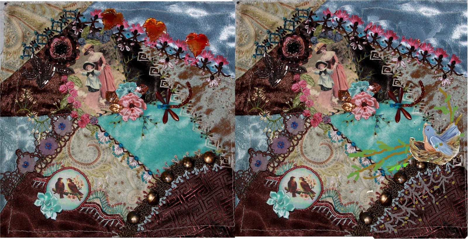
I'd love a little advice on what to do with that bare brown corner. I was thinking of putting a bird in a nest there to complementing the bird  button on the other side but I don't know!

  Gerry Help!

Oh my goodness Flora... you have one gorgeous block going here...  Your choice of image is delightful and so is the bird button... The combination of  the browns with the blues is really working and there's a lot of contrasts in texture and patterns in your fabrics.

I think the idea of a bird in a nest is a great idea because, as you mentioned,  it would complement the bird button.  But if you stuck it in the corner brown patch it would be corralled by that curved seam. and isolated from the block...  But if you perch the nest just above the patch on a branch..  it becomes a working element in the block and part of a path that moves your eye around the block...
Then you are still left with that brown patch and I'd recommend expanding your seam treatment right down into that patch to give it both texture and interest...  The last post I talked about scale and this could be a problem here....  You want to keep the bird on the nest larger than the button but smaller than the silkie... 

Remember my motto.... CQ is a pleasing arrangement of parts to their whole and to each other... Well as I looked at the block I am immediately drawn to the large beads upper right... At first I thought they were hearts but looking closer I think they are leaves... They don't relate to anything else on the block and overwhelm both the silkie and the block.  I would recommend removing them... Here is how it looks without them... right away the silkie gains importance which is why you chose it in the first place...
So what to do with that corner...?. well you need to look back into the block and you have lots to choose from... There is the oval laced collar on the lady and that shape in lace would be exquisite there...  Perhaps you could have a paisley or a fan overlapping the lace.  I notice that two of your patches have lovely paisley detail....why not use it as inspiration... One of my favorite things on this block is the incredible seam by the birds...  Those stitches and colors repeated would make an elegant fan that suits the block.. Anyway Flora whatever you do I want to see it when finished.... Okay?

And that's

Friday, August 12, 2011

Printing Images.....Answers and Important Tips!!!

2 part question from follower Sandi:  "May I ask what kind of fabric you use to print on? "

Well as to fabric ...this question comes up often on CQI list and there are almost as many preferences as there are members... Since I was struggling with this myself until recently I can only tell you what I prefer myself...  I knew I didn't like silk  ... the images were washed out and it had little body and in general difficult for me to deal with.. I had trouble with the brands for available   at fabric stores as they were jamming up my printer or misprinting altogether.  I tried lots of different products and techniques and have settled on what is pictured at the left.  Some stitchers do not like poplin but I LOVE it and now I back it besides with the wonderful Fusible Knit Tricot recommended by Allie.


I have never had any "silkies" to work with and now will be buying a new printer to print some of my own images.  I need to buy the most reasonably priced printer that will do a good job.  I've read a little online, but kind of lost...do I need an inkjet or laser?   Thank you so much for your help, Sandi W.

I'd go for an inkjet as they are cheaper and even the cheapest printers are great now... I would recommend one with a scanner as it would be useful.  The higher price for most models are for all the extra bells and whistles..which you probably don't need..  As for brands I've always had HP with no problems... You can get a better print by checking the options or preferences feature on your printer... Choose the best or most dpi (dots per inch) for the most ink put down..


The most important things you can do are BEFORE you send the picture to the printer. 

Almost all software that comes with digital cameras have good editing options.  And there are some likely already on your computer...  Microsoft Office software has an excellent one called Microsoft Office Picture Manager and I know I sound like a broken record but unless you have photoshop or something equivalent you should absolutely download Google's Picasa...  It is FREE and has superb photo editing features which are so very easy to use by even the most inexperienced users.

Whatever you are using look for the terms like Color Editing, Color Adjustment or Color Enhancement.  It will vary with programs.  At the left is the Color box from Microsoft Office Photo Manager.  When you find that catagory the key thing you want to look for is the term "saturation"  There is usually a little bar and an arrow you can slide either way.. see bottom of photo on left.


When you increase the saturation  it intensifies the color already in the picture. Usually when you print you lose some of the color in the original and your printed version looks washed out...  By increasing the saturation before you print you get a much stronger image with very good color even though the saturated view on your screen looks rather powerful..  On the left is the original photo in my file... I kept moving the arrow on the saturation scale until it is as high as it will go and that is on the far right..  Allowing for inevitable color drop in printing process the final print from saturated photo will equal or be better than original..

As an aside if you move the satuation arrow to the left you can change a color photo to black and white.  This is often preferred if you are looking for a vintage look..

The second most important thing you can do for a better print is look for the option that allows you to sharpen your image... It will usually just says "Sharpen."  Not all programs have this option but Google's Picasa does and I use it on ALL my images for print.. This does indeed sharpen all edges in the photo and gives a much clearer print. Like losing color when you print you also lose detail... This takes care of that aspect.  Below it is not quickly apparent the difference sharpening makes  but look at the detail on the flowers and in the nest and on the wing and you can see it.  This is a subtle difference but  is the finishing touch for a superb print..  Try it.